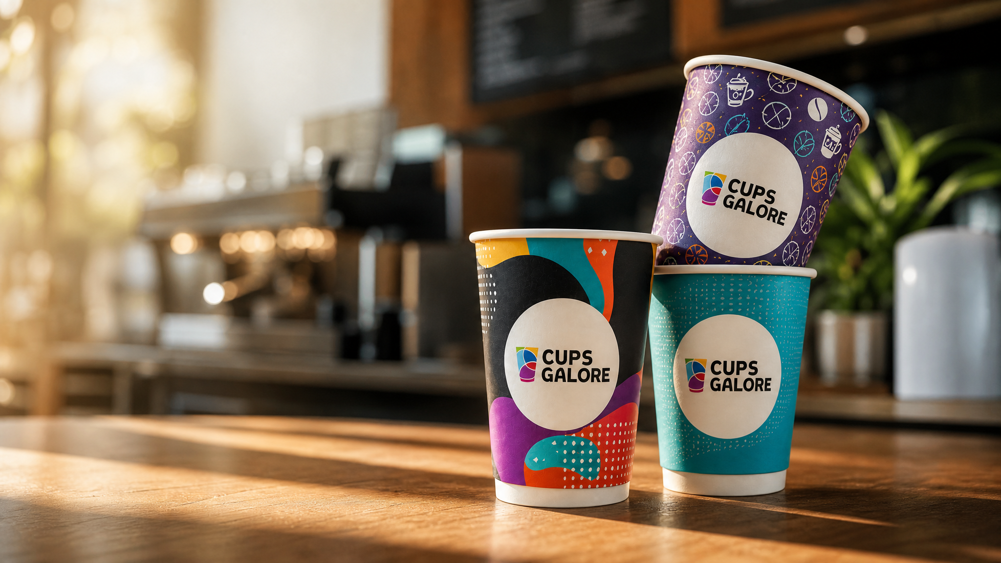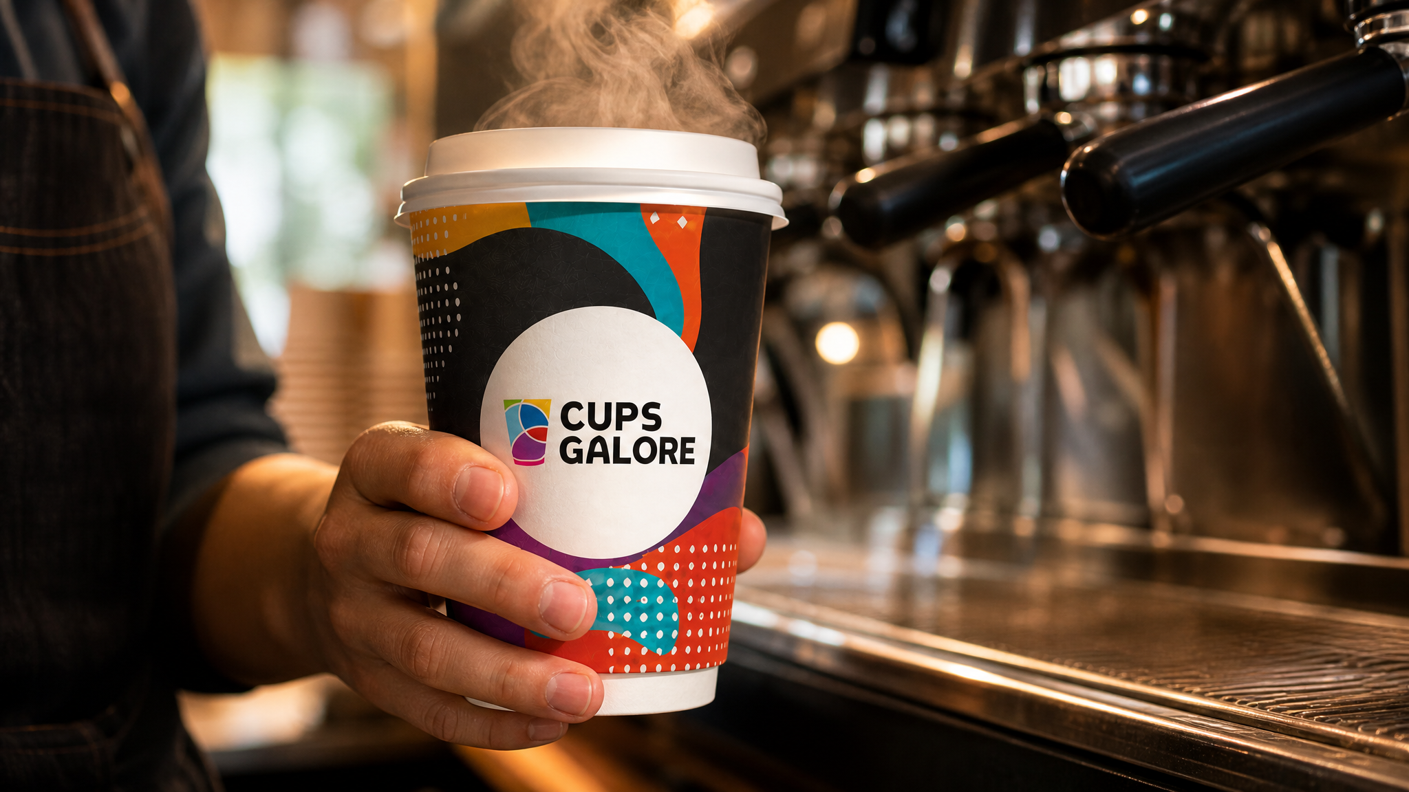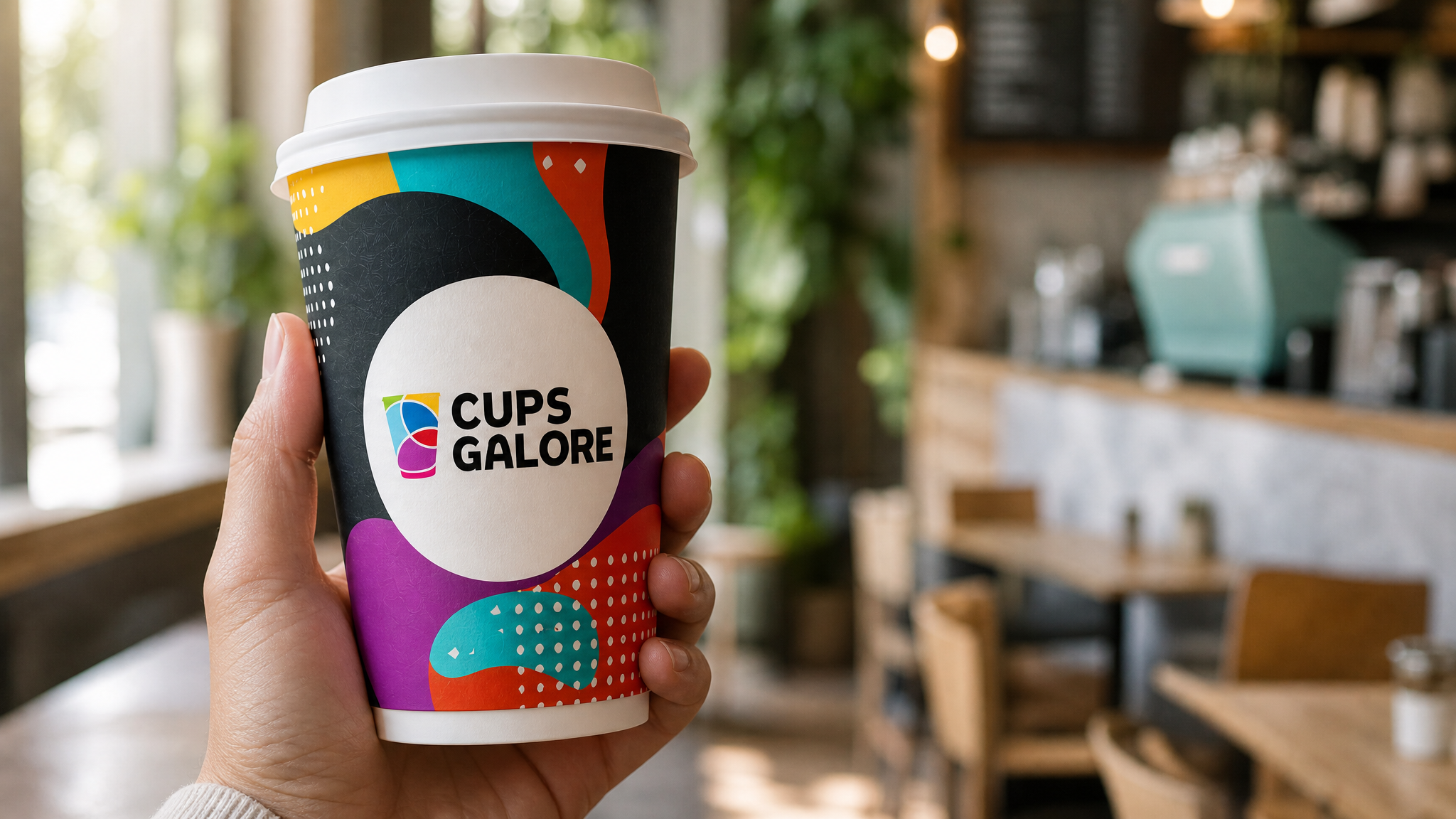
Ask a cafe owner what their most-viewed piece of marketing is. They will usually say their Instagram feed, their signage, or their menu board. The right answer is almost always the takeaway coffee cup.
A busy cafe hands out several hundred cups a day. Each one gets held, walked through public space, sat on desks, photographed and shared on social. Compared to the reach of a paid ad campaign at the same investment level, the branded takeaway cup wins on almost every metric that matters.
Here is why a well-designed cup is one of the highest-leverage brand assets a cafe owns, and what separates a cup that works commercially from one that just carries a logo.
The maths on cup impressions
A cafe doing 300 takeaway coffees a day hands out roughly 90,000 cups a year. Every one of those cups gets held for around 15 to 30 minutes on average. It gets seen by the person carrying it, by everyone they walk past, and by the coworkers or friends they arrive with.
At conservative assumptions on ambient impressions per cup, the annual reach of a mid-sized cafe's takeaway cups sits in the hundreds of thousands of brand exposures. That reach is delivered at a cost per impression that no paid channel can approach.
The cup is doing brand marketing whether the cafe treats it that way or not.
What separates a working cup from a decorative one
Three principles show up consistently in cafe brands that use their cups well.
Legibility at arm's length. The cup is read from a metre away, held out in a hand or sitting on a desk. Type that requires close reading disappears. Bold marks, strong contrast and clear typography win.
Photographable design. Instagram is the single largest amplifier of a cup's brand impact. Cups that photograph well drive user-generated content. Cups that photograph badly do not get shared. Simple, high-contrast, visually distinctive design travels through social media faster than complex illustration.
Consistency across sizes. A brand that looks right on 8oz and wrong on 16oz has a design system problem. Get the artwork working across every size on the menu.
Where cafes leave value on the table
Three failure patterns show up.
Treating the cup as neutral packaging. Plain white cups with a small logo. Functional but forgettable. The brand is invisible.
Overdesigning. Too many colours, too much illustration, type that competes with the mark. Reads as busy in hand and worse in photograph.
Inconsistency across sizes and finishes. A cafe with a great 12oz design and a generic 8oz is telling customers that only some parts of the brand matter.
What good cup design looks like
The strongest cafe cup designs share three qualities.
A single strong idea. One mark, one type treatment, one colour system. Recognisable at a glance.
Deliberate finish choice. Matte reads premium and photographs well in mixed light. Gloss reads bright and pops in daylight. Kraft (unbleached) reads sustainable and grounded. Each is a positioning decision, not a default.
Print-ready artwork built for cup substrate. Colours specified against Pantone references, artwork built to the actual dieline of the cup rather than assumed geometry. The design that looks perfect in a mockup often needs adjustment for the physical curve.
The takeaway
Custom-printed coffee cups are one of the highest-reach, lowest-cost brand channels available to cafes and businesses in Australia. Treated as brand media rather than functional packaging, they earn more than their cost several times over.
Cups Galore produces custom-printed paper cups for cafes, businesses and events across Australia. HACCP and ISO 9001 certified, low MOQ from 500 cups, rush orders available.
Explore our range of custom branded cups.